


Categories crowd. Attention fragments. Touchpoints multiply. Most brands blend in, but the strongest brands are recognized before a word is read.
At Evolvcraft, identity is not a logo. It is the visual and verbal system that makes a strategy visible, recognizable, and impossible to confuse with anyone else.



More than recognition.
A brand identity is often mistaken for a logo, a color, a typeface chosen because it looked right on a moodboard. In practice it is the first and most frequent point of contact a person has with a brand, appearing on a screen, a package, an invoice, a storefront, long before anyone reads a word of positioning or hears a pitch. What people feel about a brand in that first half second, before conscious thought catches up, is built almost entirely by identity. Get it right and it becomes a genuine asset, something that compounds in value with every consistent impression. Get it wrong, or leave it inconsistent, and even the strongest strategy underneath is invisible.
Built on strategy, not aesthetics.
An identity that is not rooted in strategy is decoration. It might be beautiful, on trend, even award winning, but it will not hold up, because there is nothing underneath it to defend a single decision when a stakeholder pushes back or a market shifts. Every choice in an identity system, a shape, a shade of a color, the warmth or restraint of a tone of voice, should trace back to something already decided in Strategy: who the brand serves, what it stands for, and why it deserves to exist in a category that does not need another entrant. Identity is where those decisions become visible and felt. It is translation, not invention.

Strong Brand Identities exist across all touchpoints
A brand has to hold together across wording and language, the vocabulary and tone that make a brand sound like itself in a headline or a customer support reply. Across typography and color, the visual signals that trigger recognition before anyone reads a single word. Across a broader design and visual language, the photography, iconography, motion, and layout principles that keep every touchpoint feeling authored by the same hand. And increasingly, across the senses that live outside a screen: the haptic quality of a product or packaging material, the sound of a notification or a brand's sonic signature, the way a space feels to walk through.
A complete identity system accounts for all of it, because a brand is judged everywhere it shows up.
What Identity delivers
Logo & Visual Identity System
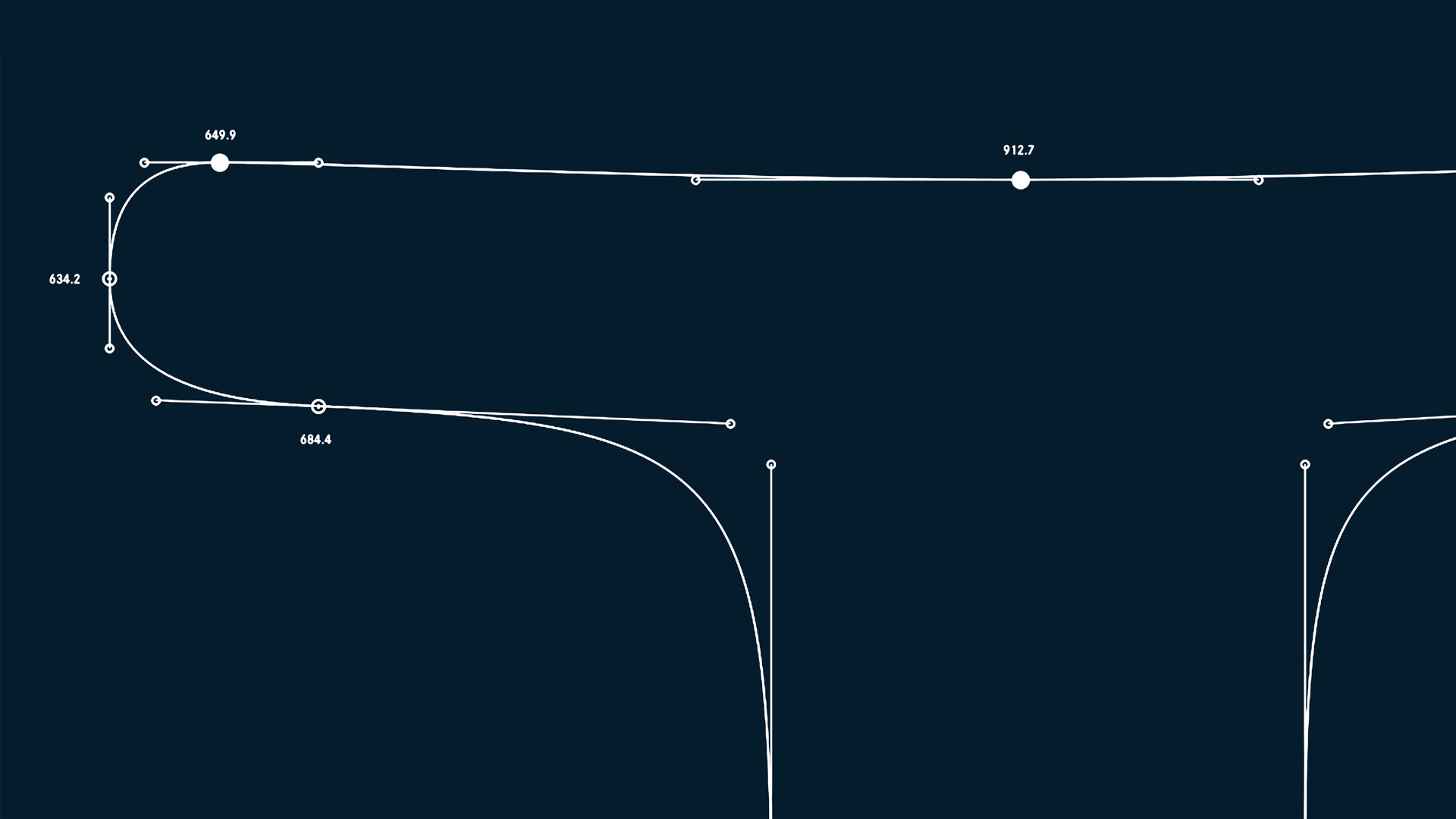
The logo, wordmark, and the visual language built around it, the elements a brand is recognized by before a single word is read. A strong logo is not the entire identity, but it is the anchor everything else refers back to: distinct enough to be owned, simple enough to scale from a favicon to a building facade.
Color & Typography System
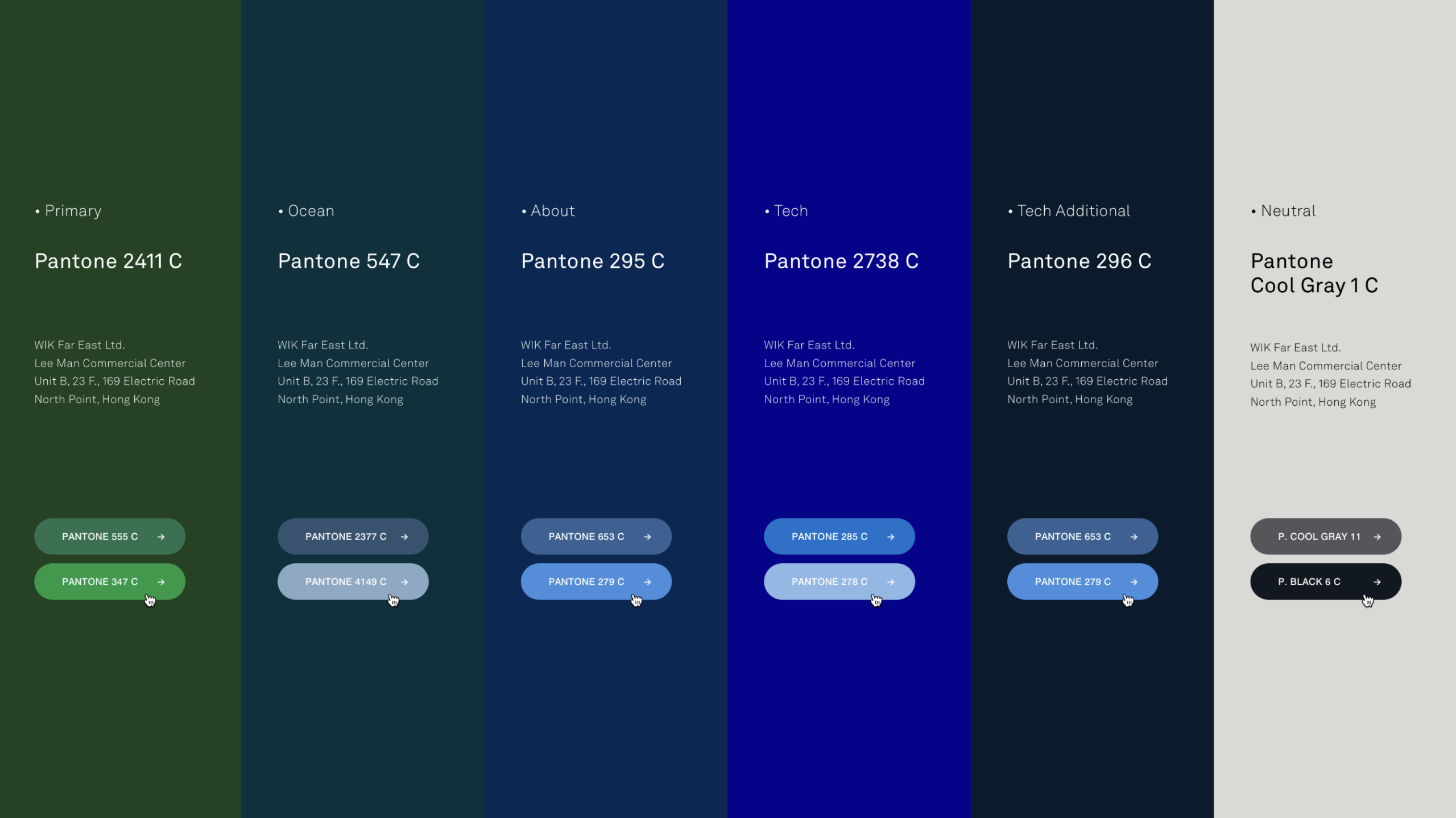
A defined palette and type system built for consistency across hundreds of applications, not just the ones seen at launch. What matters is not the choice itself, but that it holds its meaning wherever it appears, from a business card to a billboard.
Verbal Identity & Tone of Voice
The way a brand sounds, independent of who is writing it. Tone of voice turns a positioning statement into language a team can actually use, in a headline, a support email, or a caption, without losing what makes the brand itself.
Brand Guidelines
The reference that keeps a system intact as it moves through different hands, agencies, and channels. Guidelines are not a rulebook for its own sake. They are what allows a brand to stay recognizable without a single person policing every use.
Applied Identity Templates
The system translated into the formats a brand actually uses: decks, social templates, packaging, signage, or product. This is where an identity proves whether it was built for real use or only for a presentation.
Brand Asset Library
A single, organized source for every logo file, template, and guideline a team or partner will ever need. It turns an identity from a one time design exercise into a system the brand can keep using correctly for years.
Trusted by ambitious brands
Over the past 15 years, Evolvcraft has helped shape the Identity of both emerging startups and internationally recognized market leaders.